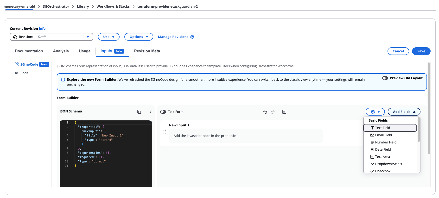
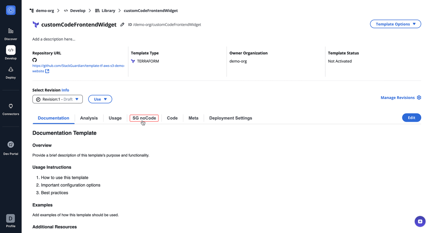
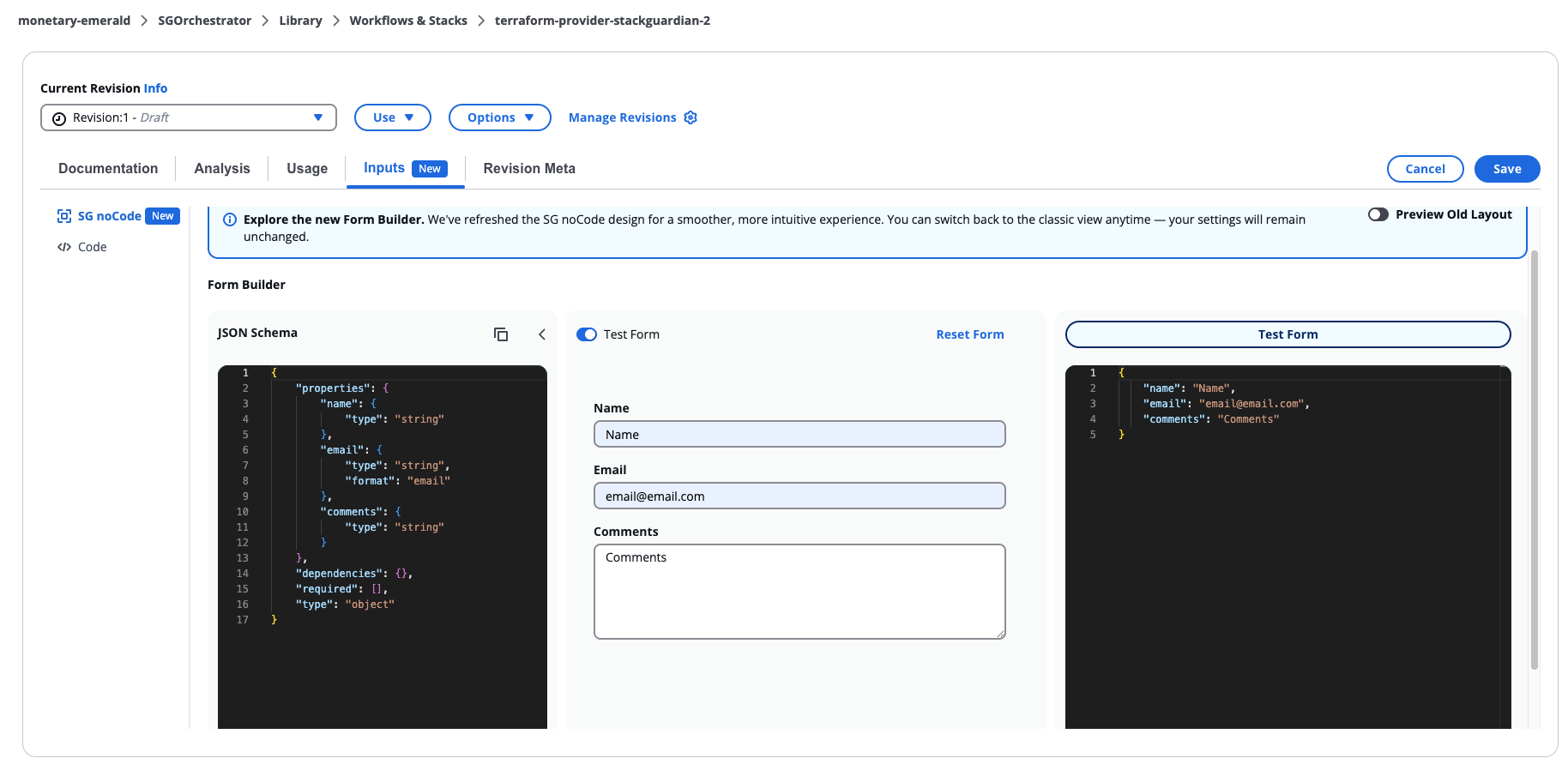
SG noCode Form Builder
Overview
The Form Builder interface is organized into three main areas that work together to define and preview the form:
- JSON Schema Panel (Left Column)
- Form Preview (Center Column)
- Fields Palette (Add Fields button)
Users may switch between View Mode and Edit Mode depending on their permissions or configuration needs.
SG noCode Form Builder
Builder Modes
View Mode
View Mode displays the form without allowing structural modifications. Users can:
- Inspect form fields
- Review layout and labels
- View conditional indicators
- Validate field structure
This mode is typically used by users who have read-only access or who only need to review the form configuration.
Edit Mode
Edit Mode enables full editing capabilities within the builder. When activated, the full layout becomes interactive. Users can:
- Add or remove fields
- Reorder fields
- Modify field configuration
- Edit the underlying schema
- Configure conditional logic
- Test form behavior
JSON Schema Panel
The JSON Schema Panel displays the underlying schema that defines the form structure. This schema represents the authoritative configuration used by the platform to render and validate the form. Users can:
- Scroll through the schema
- Expand the panel for detailed editing
- Collapse the panel to focus on the visual editor
- Modify the schema directly
Changes made in the schema are reflected in the Form Preview.
Direct editing of the schema is typically used by advanced users who need to implement configurations not available through the visual editor.
Form Preview
The Form Preview displays a live rendering of the form while it is being built. The preview allows users to interact with fields and manage the layout in real time. Available actions include:
- Adding new fields
- Reordering fields
- Editing field settings
- Removing fields
- Entering Test Mode
Each field is represented as a field card containing configuration controls. Field cards include:
- Settings icon – opens the field configuration modal
- Delete icon – removes the field from the form
- Indicators showing whether the field is:
- Required
- Disabled
- Controlled by conditional logic
The preview updates immediately when changes are made.
Fields Palette
The Fields Palette provides the components that can be added to the form.
Fields can be dragged into the preview area and positioned anywhere within the form.
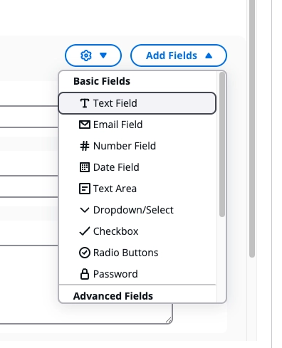
Fields Palette
Basic Fields
Basic fields represent standard input types. Available fields include:
- Text Field
- Email Field
- Number Field
- Date Field
- Text Area
- Dropdown/Select
- Checkbox
- Radio Buttons
- Password
Advanced Fields
Advanced fields support more complex data input or dynamic behavior. Examples include:
- Section
- Multiselect
- Array
- Async Select
- Autosuggest
Section
Sections allow grouping related fields into logical blocks within the form.
Additional properties:
Sections support an optional Allow additional properties setting, accessible from the Basic tab in the Section Settings modal. When enabled, users can add their own key-value pairs at runtime in addition to, or instead of, the defined properties.
When enabled, the following options are available:
- Value Type — the type of each dynamic value: String, Number, Integer, Boolean, or Section. If Section is selected, the section itself must be configured.
- Min Properties — the minimum number of key-value pairs the user must provide
- Max Properties — the maximum number of key-value pairs allowed
- Key Pattern — an optional regex the key name must match (for example, ^[A-Z_]$)
- Key Placeholder — placeholder text shown in the key input field
Array
The Array field allows users to input a list of items of the same type. It is configured through the Configuration tab in the field settings, which includes:
- Item Type — the type of each item in the array: String, Number, Integer, Boolean, or Section. If Section is selected, the section itself must be configured by adding fields and any other required configuration.
- Item Label — the label shown for each item
- Min Items — the minimum number of items allowed
- Max Items — the maximum number of items allowed
- Unique Items — when enabled, duplicate values are not allowed
Custom Components
The builder supports custom components that extend form functionality. Available options include:
- Custom Code
- Custom Code Frontend
These components allow developers to integrate custom logic or UI behavior into the form.
Custom Code Widgets
The builder supports custom code components that allow developers to extend form functionality.
When a form contains a Custom Code Widget, an alert appears in the Form Builder asking you to acknowledge the custom code before proceeding. This ensures you have the opportunity to review the code before using it.
Before acknowledging, you can open the widget settings to inspect the code, but all other actions are disabled. Select Acknowledge Custom Code to enable full access to the form.
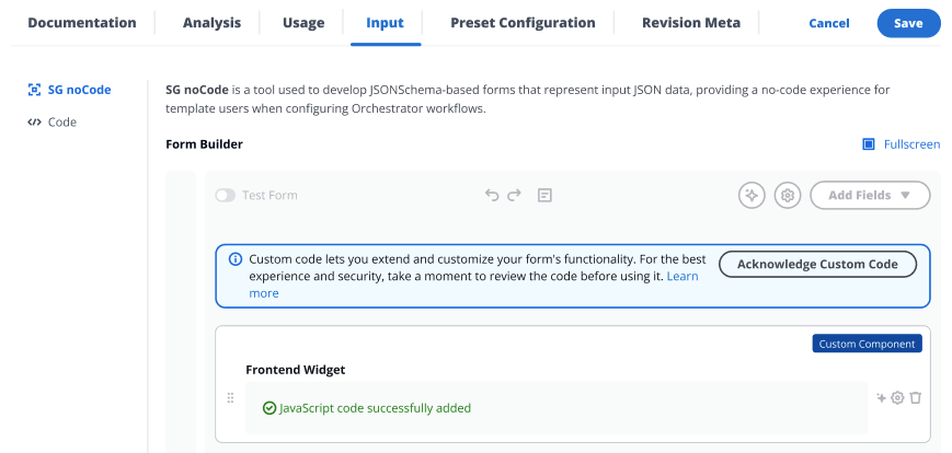
Custom Code alert
Custom Code Widget
The CustomCode widget enables dynamic and context-aware customization of form fields in real-time. By executing custom JavaScript (JS) code in a Node.js v20 runtime environment, it allows users to fetch, process, and populate form data dynamically.
Key Features:
- Dynamic Data Fetching: Fetch data from APIs or other sources in real-time.
- Custom JavaScript Support: Users can write custom JS code to handle data processing and form updates.
- Runtime Environment: Executes in a Node.js v20 environment with pre-configured capabilities.
- Contextual Awareness: Leverages variables like
sg_contextfor details such asorg,wfgrp,stack, andwf.
How it works:
Users provide custom JavaScript code in the apiSchema.handler configuration. This code is executed to process data and dynamically update the jsonSchema and uiSchema of the form.
UI Schema Properties
- API Schema - The
apiSchemakey in the UI schema is used to define the logic required for dynamic behavior. It allows you to pass custom JavaScript code, specify when it should run, and provide cloud configuration to support it.- handler - JavaScript code to be executed based on the trigger. Typically used to fetch dynamic options or perform actions on selection.
- triggerType - The
triggerTypekey defines when the JavaScript code should be executed. It supports the following values:- onLoadItems – Executes the JavaScript code when the options dropdown is opened. Applicable only to
selectandmultiselectfieldTypes. - onSelection – Executes the JavaScript code when an option is selected from the dropdown or after value has been passed in case of
stringfieldType. The onSelection trigger in the string field Custom Code widget functions behaves like an onblur event. That is , this trigger activates when the user clicks away from or leaves the field, rather than when text is selected within the field.
- onLoadItems – Executes the JavaScript code when the options dropdown is opened. Applicable only to
- Deployment Platform Config - Cloud providers can be passed and then used inside Javascript code using
deploymentPlatformConfig.
- Field Type – The
fieldTypekey in the UI schema determines the type of input field to render. It supports the following values:- select – Renders a single-select dropdown input. This is the default
fieldTypeand is commonly used for selecting one item from a list. - multiselect – Renders a multi-select dropdown input, allowing users to choose multiple options.
- string – Renders a basic text input field.
- select – Renders a single-select dropdown input. This is the default
Accessible Variables in JS Code
-
fetch- The standard JavaScript Fetch API, used for making network requests. -
SDK- TheSDKobject provides access to classes and methods exported by the following JavaScript cloud SDKs:@azure/identity@azure/arm-resources@aws-sdk/client-ec2@aws-sdk/client-ssm
These SDKs can be used within your JavaScript code to interact with Azure and AWS services programmatically.
-
sg_context- Provides contextual information and user metadata.viewContext- Contains contextual identifiers related to the current form or view. Keys may include:orgwfgrpstackwftemplatetemplateTypecurrentDeploymentPlatformConfig- Provides configuration details for the selected cloud connector, if any.
user- Contains information about the current user, such as:emailrole
token- The user's ID token (JWT). Can be used to authenticate API requests to StackGuardian’s backend or other secured endpoints.deploymentPlatformConfig- Provides configuration details for the selected cloud connector, if any. These are the AWS and Azure deployment platform configurations that can be accessed:AWS: integrationId, profileName, awsDefaultRegion, awsAccessKeyId, awsSecretAccessKeyAZURE: integrationId, profileName, armClientSecret, armClientId, armSubscriptionId, armTenantId
jsonSchema- This can be used to access current jsonSchema.uiSchema- This can be used to access current uiSchema.formData- Contains the current values of all form fields. Use this to read the value of other fields in the same form and create inter-field dependencies. Example:sg_context.formData.myFieldNameformSource- Indicates the context in which the form is being rendered — i.e., whether the user is creating or updating a resource, and which type of resource. Use this to conditionally show fields, change options, or adjust defaults based on the operation. See formSource example. Possible values:WORKFLOW_CREATE– User is creating a new workflowWORKFLOW_UPDATE– User is updating an existing workflowTEMPLATE_CREATE– User is creating a new templateTEMPLATE_UPDATE– User is updating an existing templatePOLICY_UPDATE– User is updating a policy
triggerInfo- Use this to access information about the trigger of code execution.triggerInfowill always containtriggerType(onSelectionoronLoadItems).valueSelectedis only present whentriggerTypeisonSelection, and indicates the value selected by the user. It will be absent (undefined) whentriggerTypeisonLoadItems.
- Form GUI
- Form JSON Schema
- UI Schema
  {
      "$schema": "http://json-schema.org/schema#",
      "type": "object",
      "properties": {
          "workflow_output": {
              "title": "Workflow Outputs",
              "type": "string"
          }
      }
  }
{
  "workflow_output": {
      "ui:widget": "CustomCodeWidget",
      "ui:title": "Workflow Outputs",
      "apiSchema": {
          "triggerType": ["onLoadItems"],
          "handler": "// Base API URL\n" +
                    "const baseUrl = 'https://testapi.qa.stackguardian.io';\n" +
                    "\n" +
                    "// Extract params from sg_context\n" +
                    "let orgName = sg_context?.viewContext?.org || 'demo-org';\n" +
                    "let wfGrpName = sg_context?.viewContext?.wfgrp || 'tf-init-richard-test-cases';\n" +
                    "let stackName = sg_context?.viewContext?.stack || '';\n" +
                    "let stackId = stackName ? `/stacks/${stackName}` : '';\n" +
                    "let token = sg_context?.token;\n" +
                    "\n" +
                    "let finalOptions = [];\n" +
                    "\n" +
                    "// API URL to fetch workflows\n" +
                    "let apiUrl = `${baseUrl}/api/v1/orgs/${orgName}/wfgrps/${wfGrpName}${stackId}/wfs/listall/`;\n" +
                    "const api_response = await fetch(apiUrl, {\n" +
                    "  headers: {\n" +
                    "    Authorization: `${token}`\n" +
                    "  }\n" +
                    "});\n" +
                    "\n" +
                    "// Parse JSON response\n" +
                    "let listallWfs = await api_response.json();\n" +
                    "\n" +
                    "// Iterate over workflows to fetch outputs\n" +
                    "for (let i = 0; i < listallWfs.msg.length; i++) {\n" +
                    "  try {\n" +
                    "    let item = listallWfs.msg[i];\n" +
                    "    let wfName = item.ResourceName;\n" +
                    "    let wfOutputUrl = `${baseUrl}/api/v1/orgs/${orgName}/wfgrps/${wfGrpName}${stackId}/wfs/${wfName}/outputs/`;\n" +
                    "    let outputResponse = await fetch(wfOutputUrl, {\n" +
                    "      headers: {\n" +
                    "        Authorization: `${token}`\n" +
                    "      }\n" +
                    "    });\n" +
                    "    let wfData = await outputResponse.json();\n" +
                    "    let wfOutputs = wfData?.data?.outputs || {};\n" +
                    "\n" +
                    "    Object.keys(wfOutputs).forEach(key => {\n" +
                    "      finalOptions.push({\n" +
                    "        label: `${wfGrpName}.${stackName}.${wfName}.${key}.value`,\n" +
                    "        value: `${wfGrpName}.${stackName}.${wfName}.${key}.value`\n" +
                    "      });\n" +
                    "    });\n" +
                    "  } catch (e) {\n" +
                    "    console.log(e);\n" +
                    "  }\n" +
                    "}\n" +
                    "\n" +
                    "// Update jsonSchema and uiSchema\n" +
                    "let modifiedUISchema = { workflow_output: { 'ui:widget': 'select' } };\n" +
                    "let modifiedJsonSchema = { type: 'object', properties: {} };\n" +
                    "modifiedJsonSchema.properties['workflow_output'] = {\n" +
                    "  type: 'string',\n" +
                    "  title: 'Workflow Outputs',\n" +
                    "  enum: finalOptions.map(item => item.value)\n" +
                    "};\n" +
                    "return { jsonSchema: modifiedJsonSchema, uiSchema: modifiedUISchema };"
      }
  }

}
The code dynamically fetches workflow outputs based on the context (org, workflow group, and stack) and populates a dropdown field in the form with those outputs.
// Base API URL
const baseUrl = 'https://testapi.qa.stackguardian.io';

// Extract params from sg_context
let orgName = sg_context?.viewContext?.org || 'demo-org';
let wfGrpName = sg_context?.viewContext?.wfgrp || 'tf-init-richard-test-cases';
let stackName = sg_context?.viewContext?.stack || '';
let stackId = stackName ? `/stacks/${stackName}` : '';
let token = sg_context?.token;

let finalOptions = [];

// API URL to fetch workflows
let apiUrl = `${baseUrl}/api/v1/orgs/${orgName}/wfgrps/${wfGrpName}${stackId}/wfs/listall/`;
const api_response = await fetch(apiUrl, {
  headers: {
    Authorization: `${token}`,
  },
});

// Parse JSON response
let listallWfs = await api_response.json();

// Iterate over workflows to fetch outputs
for (let i = 0; i < listallWfs.msg.length; i++) {
  try {
    let item = listallWfs.msg[i];
    let wfName = item.ResourceName;
    let wfOutputUrl = `${baseUrl}/api/v1/orgs/${orgName}/wfgrps/${wfGrpName}${stackId}/wfs/${wfName}/outputs/`;

    // Fetch output
    let outputResponse = await fetch(wfOutputUrl, {
      headers: {
        Authorization: `${token}`,
      },
    });

    let wfData = await outputResponse.json();
    let wfOutputs = wfData?.data?.outputs || {};

    // Populate dropdown options
    Object.keys(wfOutputs).forEach((key) => {
      finalOptions.push({
        label: `${wfGrpName}.${stackName}.${wfName}.${key}.value`,
        value: `${wfGrpName}.${stackName}.${wfName}.${key}.value`,
      });
    });
  } catch (e) {
    console.error(e);
  }
}

// Update jsonSchema and uiSchema
let modifiedUISchema = { workflow_output: { 'ui:widget': 'select' } };
let modifiedJsonSchema = { type: 'object', properties: {} };
modifiedJsonSchema.properties['workflow_output'] = {
  type: 'string',
  title: 'Workflow Outputs',
  enum: finalOptions.map((item) => item.value),
};

return { jsonSchema: modifiedJsonSchema, uiSchema: modifiedUISchema };
Context Inputs
Context Inputs let you set example values for the context variables available in your JavaScript code. Use them to test and debug your code directly within the builder. The following context variables are available:
- viewContext — contextual identifiers for the current form:
org— the organization namewfgrp— the workflow group namestack— the Stack namewf— the Workflow nametemplate— the template nametemplateType— the template typecurrentDeploymentPlatformConfig— the selected cloud connector, used for testing your JavaScript only
- user — information about the current user:
EmailandRole - formSource — the context in which the form is being rendered (for example,
Workflow Update) - formData — the current form data, expressed as a JSON object
Custom Frontend Widget
The CustomCodeFrontend widget enables dynamic and context-aware customization of form fields in real-time, allowing users to fetch, process, and populate form data dynamically. Unlike the CustomCode widget, where the JavaScript code is executed in a backend Lambda environment, this widget executes the JavaScript directly in the user's browser.
This is useful for scenarios where users need to dynamically adjust the form fields based on real-time data, such as fetching workflow outputs from the StackGuardian API.
The CustomCodeFrontend widget does not make use of Cloud Connectors (Azure, AWS, GCP) to fetch data from Cloud Providers. For these use cases, the CustomCodeWidget should be used.
Key Features:
- Dynamic Data Fetching: Fetch data from APIs or other sources in real-time.
- Custom JavaScript Support: Users can write custom JavaScript to handle data processing and form updates.
- Contextual Awareness: Leverages variables like
sg_contextfor details such asorg,wfgrp,stack, andwf.
How it works:
Users provide custom JavaScript code in the apiSchema.handler configuration. This code is executed directly in the frontend (in the user's browser) to process data and dynamically update the jsonSchema and uiSchema of the form.
UI Schema Properties
- API Schema - The
apiSchemakey in the UI schema is used to define the logic required for dynamic behavior. It allows you to pass custom JavaScript code, specify when it should run, and provide cloud configuration to support it.- handler - JavaScript code to be executed based on the trigger. Typically used to fetch dynamic options or perform actions on selection.
- triggerType - The
triggerTypekey defines when the JavaScript code should be executed. It supports the following values:- onLoadItems – Executes the JavaScript code when the options dropdown is opened. Applicable only to
selectandmultiselectfieldTypes. - onSelection – Executes the JavaScript code when an option is selected from the dropdown or after value has been passed in case of
stringfieldType.
- onLoadItems – Executes the JavaScript code when the options dropdown is opened. Applicable only to
- Field Type – The
fieldTypekey in the UI schema determines the type of input field to render. It supports the following values:- select – Renders a single-select dropdown input. This is the default
fieldTypeand is commonly used for selecting one item from a list. - multiselect – Renders a multi-select dropdown input, allowing users to choose multiple options.
- string – Renders a basic text input field.
- select – Renders a single-select dropdown input. This is the default
Accessible Variables in JS Code
fetch- The standard JavaScript Fetch API, used for making network requests.sg_context- Provides contextual information and user metadata.viewContext- Contains contextual identifiers related to the current form or view. Keys may include:orgwfgrpstackwftemplatetemplateType
user- Contains information about the current user, such as:emailrole
token- The user's ID token (JWT). Can be used to authenticate API requests to StackGuardian’s backend or other secured endpoints.jsonSchema- This can be used to access current jsonSchema.uiSchema- This can be used to access current uiSchema.formData- Contains the current values of all form fields. Use this to read the value of other fields in the same form and create inter-field dependencies. Example:sg_context.formData.myFieldNameformSource- Indicates the context in which the form is being rendered — i.e., whether the user is creating or updating a resource, and which type of resource. Use this to conditionally show fields, change options, or adjust defaults based on the operation. See formSource example. Possible values:WORKFLOW_CREATE– User is creating a new workflowWORKFLOW_UPDATE– User is updating an existing workflowTEMPLATE_CREATE– User is creating a new templateTEMPLATE_UPDATE– User is updating an existing templatePOLICY_UPDATE– User is updating a policy
triggerInfo- Use this to access information about the trigger of code execution.triggerInfowill always containtriggerType(onSelectionoronLoadItems).valueSelectedis only present whentriggerTypeisonSelection, and indicates the value selected by the user. It will be absent (undefined) whentriggerTypeisonLoadItems.
- Form GUI
- Form JSON Schema
- UI Schema
  {
    "$schema": "http://json-schema.org/schema#",
    "type": "object",
    "properties": {
        "workflows": {
            "type": "string",
            "title": "Workflow List",
            "description": "Select your workflow",
            "enum": [
                "CUSTOM-TEdH",
                "CUSTOM-4sg7",
                "test-26-May",
                "CUSTOM-gitlab",
                "CUSTOM-github",
                "aws-s3-demo-website-0OH2-Copy",
                "aws-s3-demo-website-0OH2"
            ]
        },
        "outputs": {
            "title": "Workflow Outputs",
            "type": "string"
        }
    }
 }
  {
    "workflows": {
        "ui:widget": "select"
    },
    "outputs": {
        "ui:widget": "CustomCodeFrontendWidget",
        "apiSchema": {
            "triggerType": [
                "onLoadItems"
            ],
            "handler": "// Base API URL\nconst baseUrl = \"https://testapi.qa.stackguardian.io\";\n\n// Extract org and wfgrp from sg_context\nlet orgName = sg_context?.viewContext?.org || 'demo-org';\nlet wfGrpName = sg_context?.viewContext?.wfgrp || 'demo-wf-group-1';\n\n// Extract token from sg_context\nlet token = sg_context?.token;\n\nlet outputs_ = [{value:\"default\"}];\n\nconst outputsUrl = `${baseUrl}/api/v1/orgs/${orgName}/wfgrps/${wfGrpName}/wfs/${sg_context.formData.workflows}/outputs/`;\n\nconst outputsResponse = await fetch(outputsUrl, {\n    headers: {\n      Authorization: token\n    }\n  });\n\nconst outputsData = await outputsResponse.json();\nconst url = outputsData?.data?.outputs_signed_url || \"\";\n\nlet res;\nif(url){\n  try{\n      const res_ = await fetch(url);\n      const outputsData = await res_.json();\n      res = outputsData;\n  }\n  catch(err){\n      res_={}\n  }\n  \n}\n\nconst keys = Object.keys(res||{});\nkeys?.forEach((op) => {\n  outputs_.push({value : op})\n})\n\n// Define the modified JSON Schema\nlet modifiedJsonSchema = {\n  ...sg_context.jsonSchema,\n  properties: {\n ...sg_context.jsonSchema?.properties,\n    outputs: {\n      type: 'string',\n      title: 'Choose Wf Outputs',\n      description: 'Select wf otuputs',\n      \"default\": sg_context.formData?.workflows,\n      enum: outputs_?.length > 0 ? outputs_.map(item => item.value) : [] // Unique enum values\n    }\n  }\n};\n\n// Create UI Schema\nconst modifiedUISchema = {\n  ...sg_context.uiSchema\n};\n\n\n\n// Return the schemas\nreturn {\n  jsonSchema: modifiedJsonSchema,\n  uiSchema: modifiedUISchema\n};"
        }
    }
  }
The code dynamically fetches workflow outputs based on the selected workflow (read from sg_context.formData.workflows) and populates a dropdown with those output keys.
// Base API URL
const baseUrl = 'https://testapi.qa.stackguardian.io';

// Extract params from sg_context
let orgName = sg_context?.viewContext?.org || 'demo-org';
let wfGrpName = sg_context?.viewContext?.wfgrp || 'tf-init-richard-test-cases';
let stackName = sg_context?.viewContext?.stack || '';
let stackId = stackName ? `/stacks/${stackName}` : '';
let token = sg_context?.token;

let finalOptions = [];

// API URL to fetch workflows
let apiUrl = `${baseUrl}/api/v1/orgs/${orgName}/wfgrps/${wfGrpName}${stackId}/wfs/listall/`;
const api_response = await fetch(apiUrl, {
  headers: {
    Authorization: `${token}`,
  },
});

// Parse JSON response
let listallWfs = await api_response.json();

// Iterate over workflows to fetch outputs
for (let i = 0; i < listallWfs.msg.length; i++) {
  try {
    let item = listallWfs.msg[i];
    let wfName = item.ResourceName;
    let wfOutputUrl = `${baseUrl}/api/v1/orgs/${orgName}/wfgrps/${wfGrpName}${stackId}/wfs/${wfName}/outputs/`;

    // Fetch output
    let outputResponse = await fetch(wfOutputUrl, {
      headers: {
        Authorization: `${token}`,
      },
    });

    let wfData = await outputResponse.json();
    let wfOutputs = wfData?.data?.outputs || {};

    // Populate dropdown options
    Object.keys(wfOutputs).forEach((key) => {
      finalOptions.push({
        label: `${wfGrpName}.${stackName}.${wfName}.${key}.value`,
        value: `${wfGrpName}.${stackName}.${wfName}.${key}.value`,
      });
    });
  } catch (e) {
    console.error(e);
  }
}

// Update jsonSchema and uiSchema
let modifiedUISchema = { workflow_output: { 'ui:widget': 'select' } };
let modifiedJsonSchema = { type: 'object', properties: {} };
modifiedJsonSchema.properties['workflow_output'] = {
  type: 'string',
  title: 'Workflow Outputs',
  enum: finalOptions.map((item) => item.value),
};

return { jsonSchema: modifiedJsonSchema, uiSchema: modifiedUISchema };
formSource Example
The following example shows how to use formSource to offer different environment options depending on whether the user is creating or updating a workflow. On create, only safe environments are shown. On update, production becomes available and the current value is preserved as the default.
const isUpdate = sg_context.formSource === 'WORKFLOW_UPDATE';

const environmentOptions = isUpdate
  ? ['dev', 'staging', 'production']  // allow production only on update
  : ['dev', 'staging'];               // restrict to safe envs on create

return {
  jsonSchema: {
    ...sg_context.jsonSchema,
    properties: {
      ...sg_context.jsonSchema.properties,
      environment: {
        type: 'string',
        title: 'Environment',
        enum: environmentOptions,
        default: isUpdate ? sg_context.formData?.environment : 'dev',
      },
    },
  },
  uiSchema: sg_context.uiSchema,
};
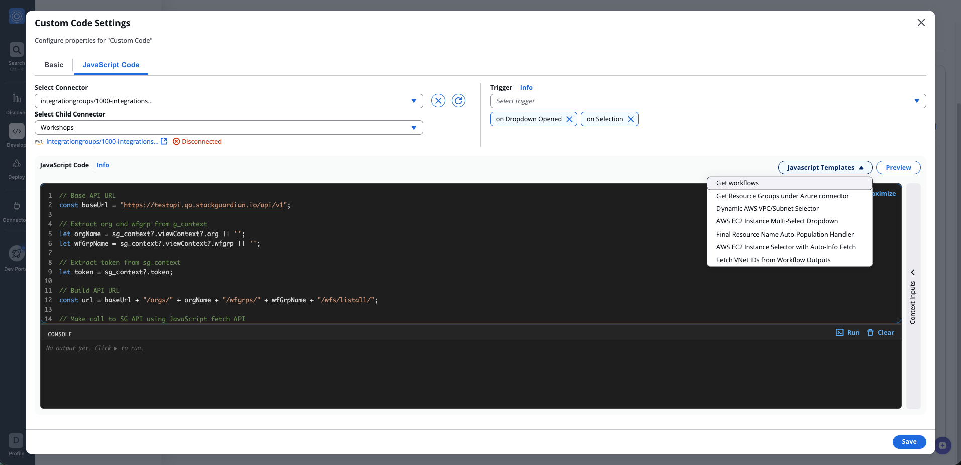
Testing Custom Code widgets
The Custom Code Widget and Frontend Widget include several tools for testing your JavaScript code directly within the builder.
Trigger defines when the JavaScript code is executed. The following options are available:
- on Dropdown Opened — executes the code when the options dropdown is opened
- on Selection — executes the code when an option is selected
The Console displays console.log outputs and errors produced when your code runs. Select Run to execute the code and Clear to reset the console output.
The Javascript Templates button provides a set of predefined code templates to use as a starting point.
Preview renders a live preview of the widget output, letting you validate the result before saving.
Testing Custom Code widgets
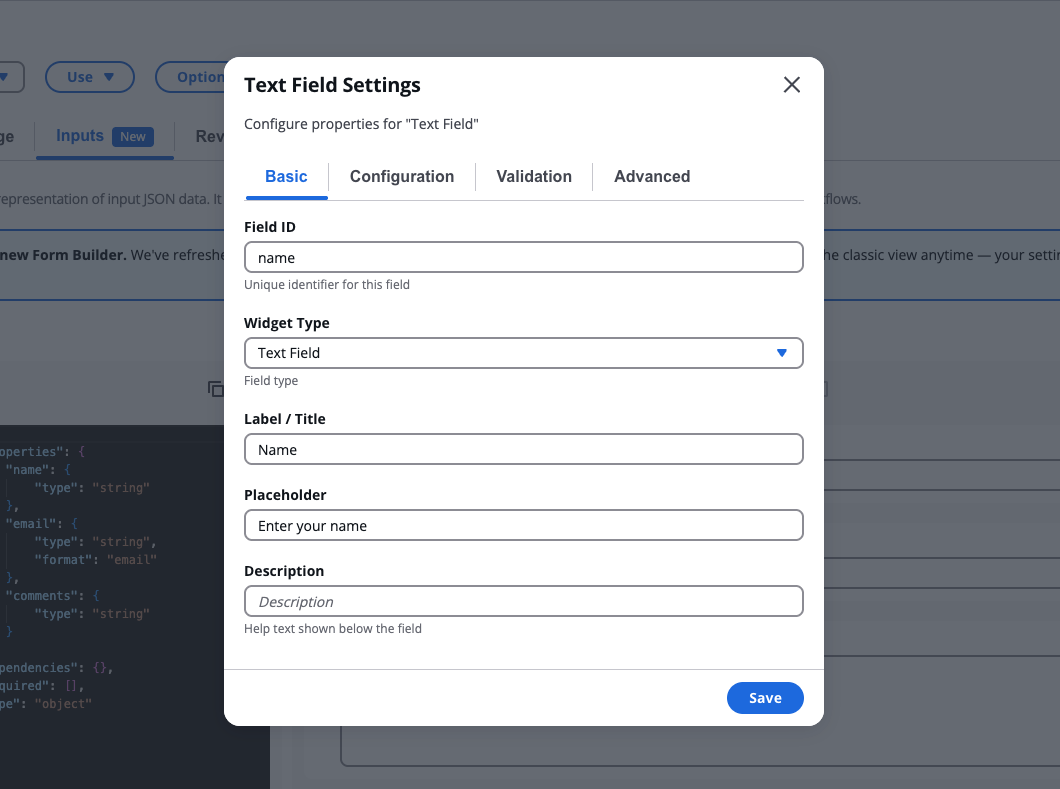
Field Configuration
Each field can be configured through the Field Settings modal, accessed via the settings icon on the field card.
The configuration modal allows editing the field's behavior and appearance.
Available settings vary based on field type and may include:
- Label
- Placeholder
- Help Text
- Required state
- Disabled state
- Conditional Logic
Selecting Save applies the changes to both:
- the visual field
- the underlying schema
Closing the modal without saving discards the changes.
Field Configuration
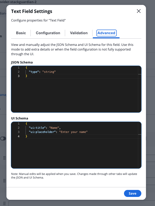
Advanced Mode
Advanced Mode allows direct editing of the form configuration using:
- JSON Schema
- UI Schema
This mode is intended for advanced users who need to configure behaviors not supported by the visual editor.
Advanced Mode can be used to:
- Modify unsupported fields
- Define custom validation rules
- Adjust UI rendering behavior
- Implement advanced schema structures
Changes made in Advanced Mode are applied when the form is saved.
Advanced Mode
Test Mode
Test Mode allows users to interact with the form and validate its behavior before deployment. When Test Mode is activated:
- The Fields Palette is replaced with a Form Data panel
- Users can enter values into the form
- Conditional logic is evaluated in real time
Test Mode allows users to:
- Validate field behavior
- Inspect output values
- Verify conditional logic
- Test custom widgets
Test Mode
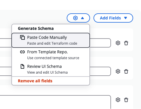
Generate schema
The Form Builder can automatically generate a form schema using the Generate schema menu, accessible from the toolbar.
Generate schema
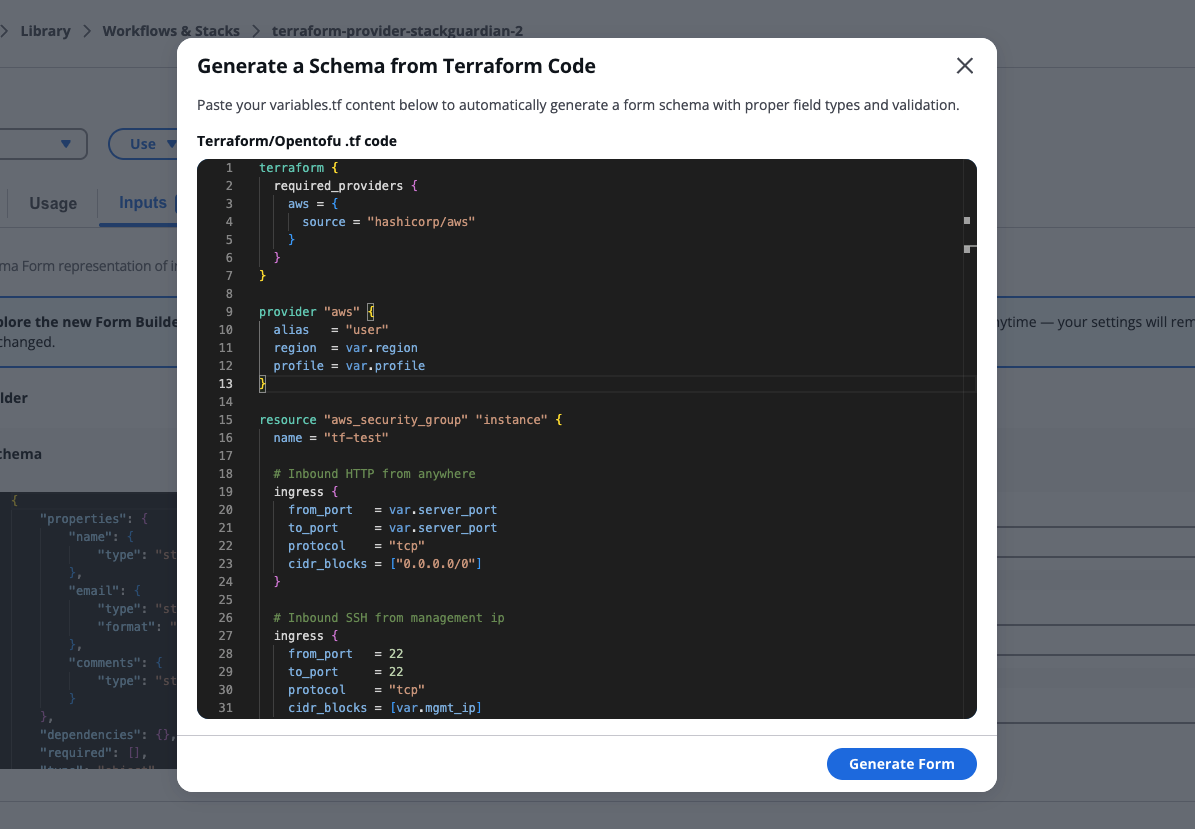
Paste code manually
Paste and edit Terraform code directly into the builder. If the code contains valid variable definitions, the builder generates form fields automatically.
Paste code manually
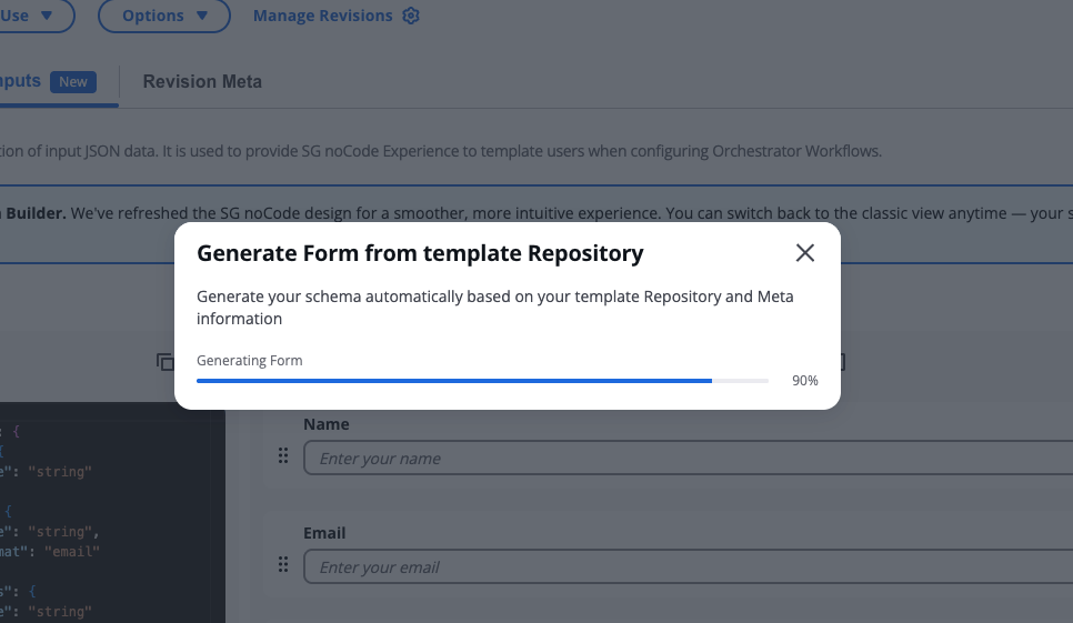
From template repository
Generates a form schema based on the connected template repository. During generation, the system clones the repository, scans Terraform files, extracts variable definitions, and converts them into form fields.
From template repository
Freeform field
Some field configurations cannot be fully supported by the visual editor. This can occur when generating a schema or when manually editing the JSON schema directly.
In the form, freeform fields are marked with a Freeform Field badge and display the following message: "This field must be edited manually in Advanced Mode using the JSON and UI Schema." To edit them, open the field settings and select the Advanced tab, where you can modify the JSON Schema and UI Schema directly.
Terraform parsing limitations
The Terraform parser supports most standard variable definitions. However, some Terraform constructs may not be supported. Examples include:
- Complex validation expressions
- Advanced Terraform functions
- Dynamically generated variables
If unsupported syntax is detected, the generation process may fail.
Users may resolve this by simplifying the Terraform configuration or manually editing the schema.
Review UI schema
Opens the JSON Schema and UI Schema editors, allowing you to view and edit the underlying schema directly. This is the same editor used when modifying unsupported fields in Advanced Mode.
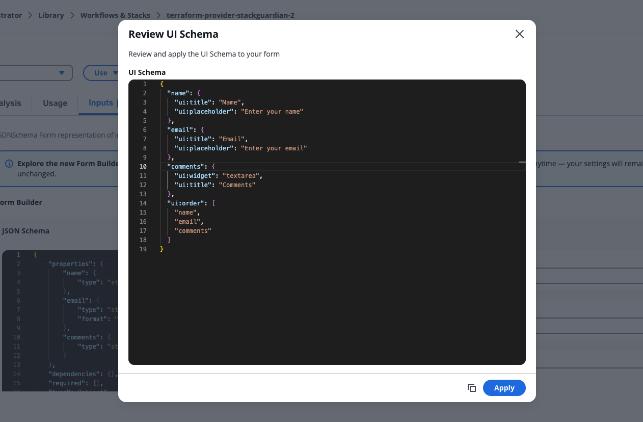
Review UI Schema
Form settings & conditions
Form settings & conditions let you manage your form's basic information and configure conditional rules. To open Form settings & conditions, select Form settings from the toolbar.
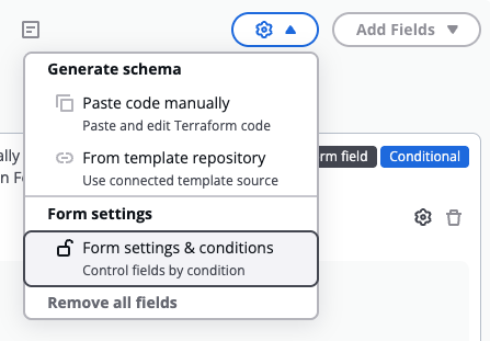
Form settings & conditions
The modal has three tabs: Basic, Conditions, and Advanced.
Basic
The Basic tab contains general form-level settings:
- Form title — the display title for the form
- Form description — help text shown below the form title
Conditions
The Conditions tab lets you define rules that control how the form reacts to user input. Each rule follows the shape: if a field meets a condition, then run a list of actions — and optionally an else list of actions if the condition is not met.
Rules are evaluated independently, meaning multiple rules can be active at the same time. Any field referenced by a rule shows a blue Conditional badge on its card in the form builder.
Each rule contains an If row (trigger field, operator, and value), a Then branch (one or more actions), and an optional Else branch enabled via Add Else branch. A single action can target multiple fields at once.
Available operators depend on the trigger field's type. Available actions depend on the target field's type.
Rules built through the visual editor are fully editable. Rules written directly in the JSON schema that use structures the editor doesn't support appear as read-only cards, where you can view the raw JSON and switch to the Advanced tab to edit them.
When saving, the builder validates all rules. If anything is missing or a referenced field no longer exists, saving is blocked and the offending input is highlighted in red.
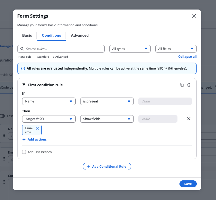
Conditions tab
Advanced
The Advanced tab provides direct access to the JSON Schema and UI Schema for the form. Use this mode to add extra details or when the form configuration is not fully supported through the visual editor.
Changes made in other tabs update the JSON and UI Schema automatically. Manual edits apply when you save.
Error Handling
During schema generation or import, several types of errors may occur. Common errors include:
Repository Configuration Errors
- Invalid repository URL
- Missing repository access permissions
- Authentication failures
Repository Retrieval Errors
- Failed to retrieve Git credentials
- Failed to clone repository
- Network access issues
Terraform Parsing Errors
- No
.tffiles found - Empty Terraform files
- No
variableblocks detected - Unsupported Terraform expressions
Schema Validation Errors
- Invalid JSON syntax
- Unsupported schema structure
- Missing required schema fields
When errors occur, descriptive messages are displayed to help users resolve the issue.